

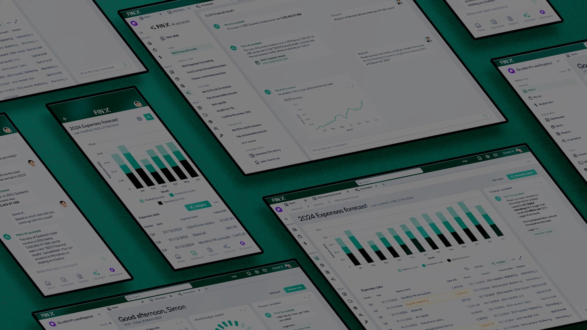
Fin X — Designing a clearer AI-assisted finance workspace
Areas
Finance Dashboards
AI-Assisted Workflows
B2B SaaS Product Concept
Overview
Fin X was designed for finance teams that need a faster, more intuitive way to understand performance, investigate changes, and turn financial data into action.
I designed a responsive workspace that brings forecasts, expense data, reporting, and AI-assisted analysis into one connected product experience. The goal was not to create another information-heavy dashboard—it was to make the path from “something changed” to “here is what to do next” feel obvious.
Role
Product Designer
Scope
Product framing · Competitive pattern review · Information architecture · User flows · Wireframes · High-fidelity UI · Responsive design · Design system foundations · Interactive prototype
Deliverables
Desktop dashboard · Forecast analysis flow · AI assistant experience · Mobile views · Clickable Figma prototype
Gallery
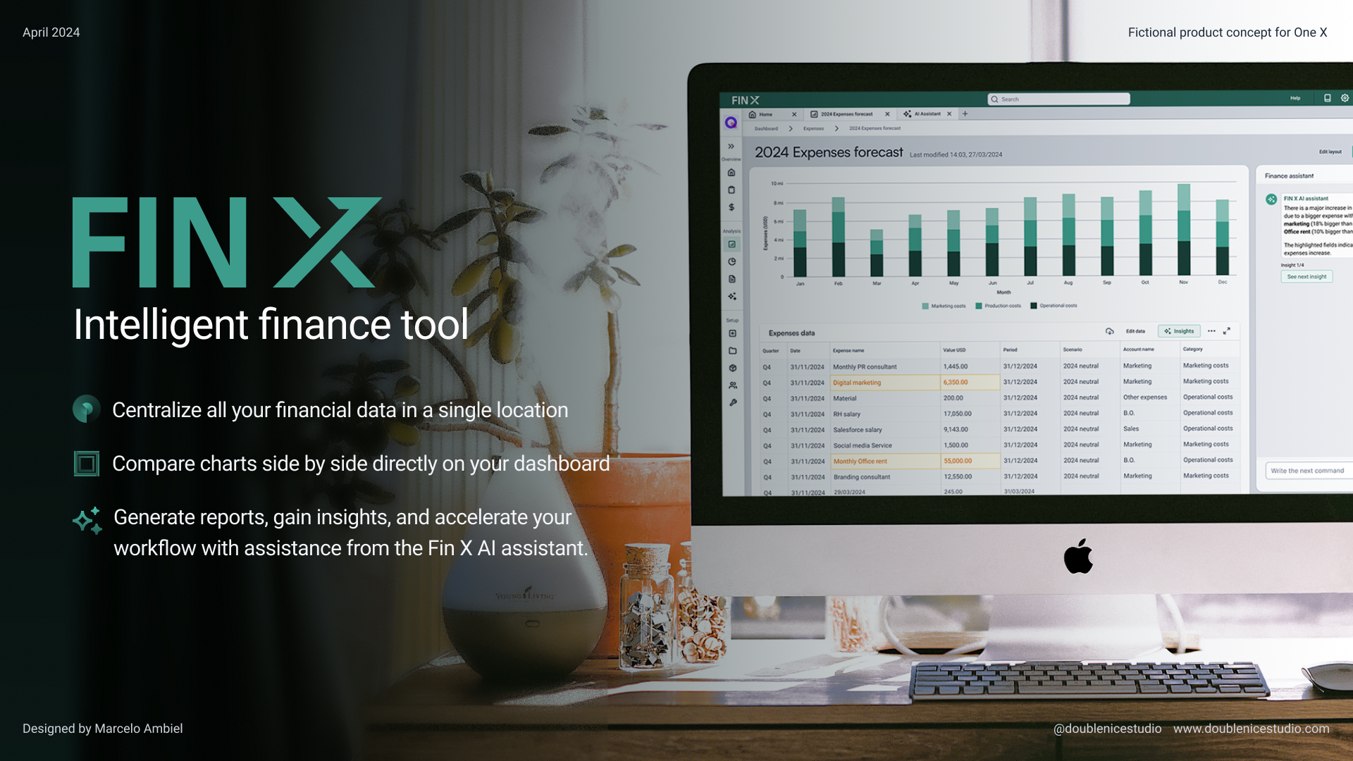
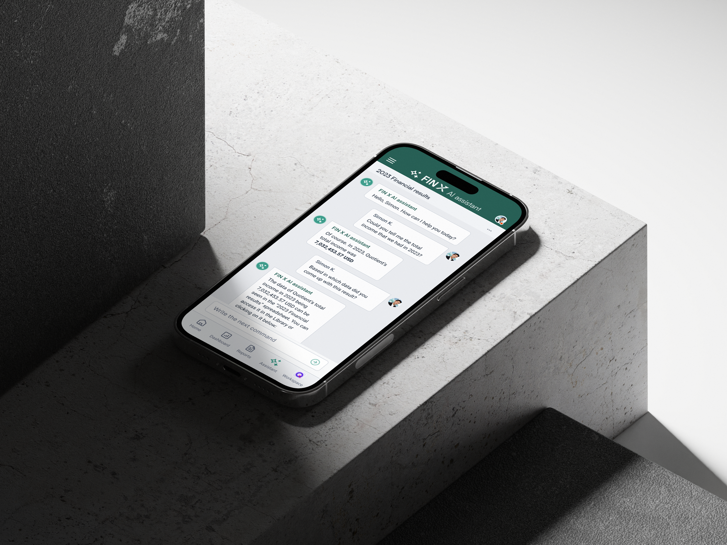
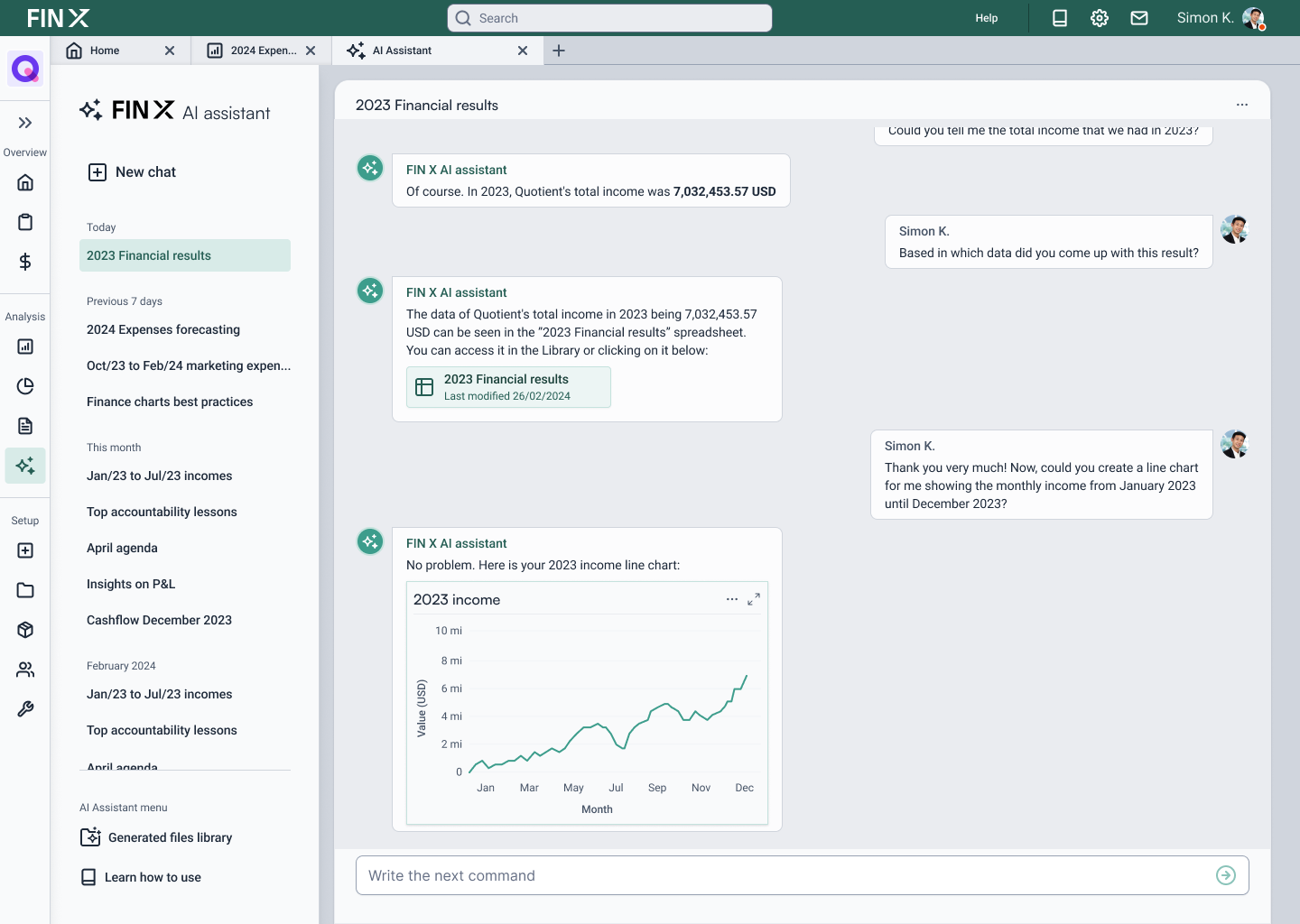
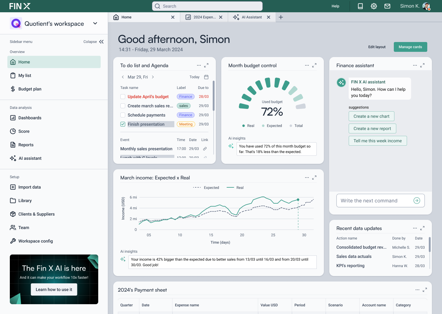
A selection of deliverables created for Fin X, including the product presentation, interface foundations, desktop workflows, mobile views, and interactive prototype.


Design process
Presented below is the comprehensive documentation detailing the design process behind the creation of the Fin X intelligent finance tool.
1 - Framing the problem
2 - An action plan
3 - Research phase
4 - Mapping the flow
5 - Designing the interfaces
6 - Prototyping interactions
7 - Presentation design
8 - Conclusion
1 - Framing the problem

Fin X banner. Source: Fin X
Fin X began with a clear challenge: design a modern financial platform for CFOs, finance analysts, and fintech teams who need to review complex data, identify changes, and act with confidence.
The experience needed to feel credible enough for enterprise users while remaining simple enough to support fast, everyday decision-making. The brief established the audience, visual direction, delivery timeline, and product areas that would define the work.
Target audience: CFOs, finance analysts, and fintech teams managing complex financial information.
Visual direction: A modern, precise, and accessible product experience that feels reliable without becoming visually dense.
Timeframe: Six days from initial briefing to a presentation-ready prototype.
Expected deliverables: Desktop and mobile concepts, core user flows, interface foundations, a clickable prototype, and final presentation materials.
These constraints shaped the project from the outset: prioritize the workflows with the highest value, establish a clear data hierarchy, and create a product story that could be understood quickly.
2 - An action plan

A glimpse of the action plan. Source: Double Nice studio
With a six-day delivery window, the process needed to be focused and intentional. I divided the work into practical milestones, moving from requirements and reference analysis to product structure, interface design, prototyping, and presentation.
Day 1: Review the brief, define the audience, identify priority workflows, and collect relevant references.
Day 2: Translate the requirements into a clear information architecture and product flow.
Day 3: Explore early concepts and create low-fidelity wireframes for the core screens.
Day 4: Establish the visual direction, build key components, and develop high-fidelity interfaces.
Day 5: Refine responsive views, interaction states, and presentation materials.
Day 6: Validate the end-to-end journey, polish the prototype, and finalize the presentation.
This structure created enough room for exploration while keeping the work aligned with the final experience from the first day.
3 - Research phase
Given the timeline, I focused on targeted product benchmarking rather than a broad research exercise. I reviewed finance, planning, analytics, and productivity platforms to understand how mature products handle dashboards, reporting, dense data, filtering, and navigation.
The objective was not to replicate existing patterns, but to identify the decisions that make complex tools feel more understandable and efficient.
3.a - Datarails
This benchmark helped establish how AI can sit close to data without overwhelming the main workflow. I looked at its dashboard hierarchy, visual summaries, and the balance between automated insight and direct user control.
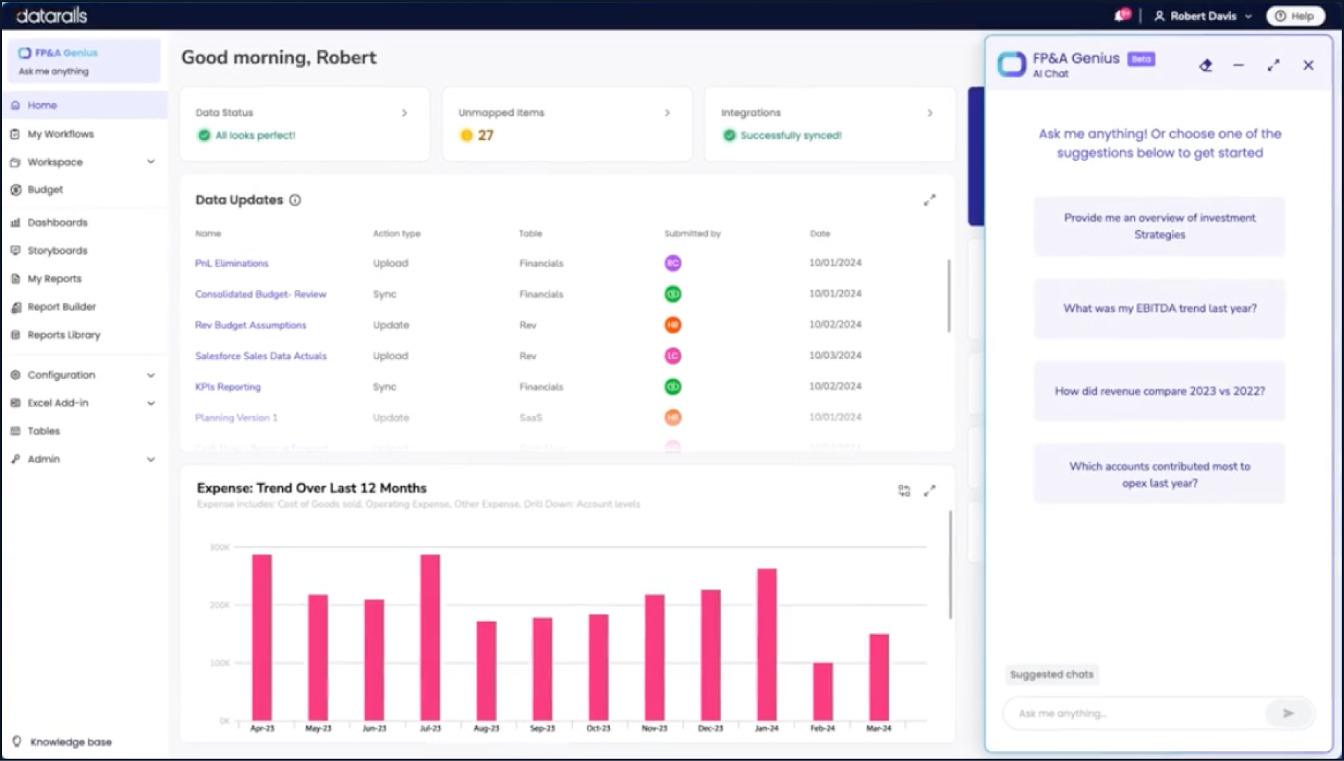
Datarails web app homescreen. Source: www.datarails.com

Datarails web app dashboard. Source: www.datarails.com
3.b - Planful
Planful was a useful reference for enterprise financial workflows, particularly around forecasting, reporting, comparisons, and table-heavy analysis. It reinforced the importance of allowing users to move from high-level signals into detailed data without losing context.

Planful web app AI predict feature. Source: www.planful.com

Planful AI assisted data analysis. Source: www.planful.com
3.c - Clickup
ClickUp provided useful references outside the finance category. Its modular navigation, workspace structure, and personalized overview patterns informed how Fin X could remain flexible and scalable as the product expanded.
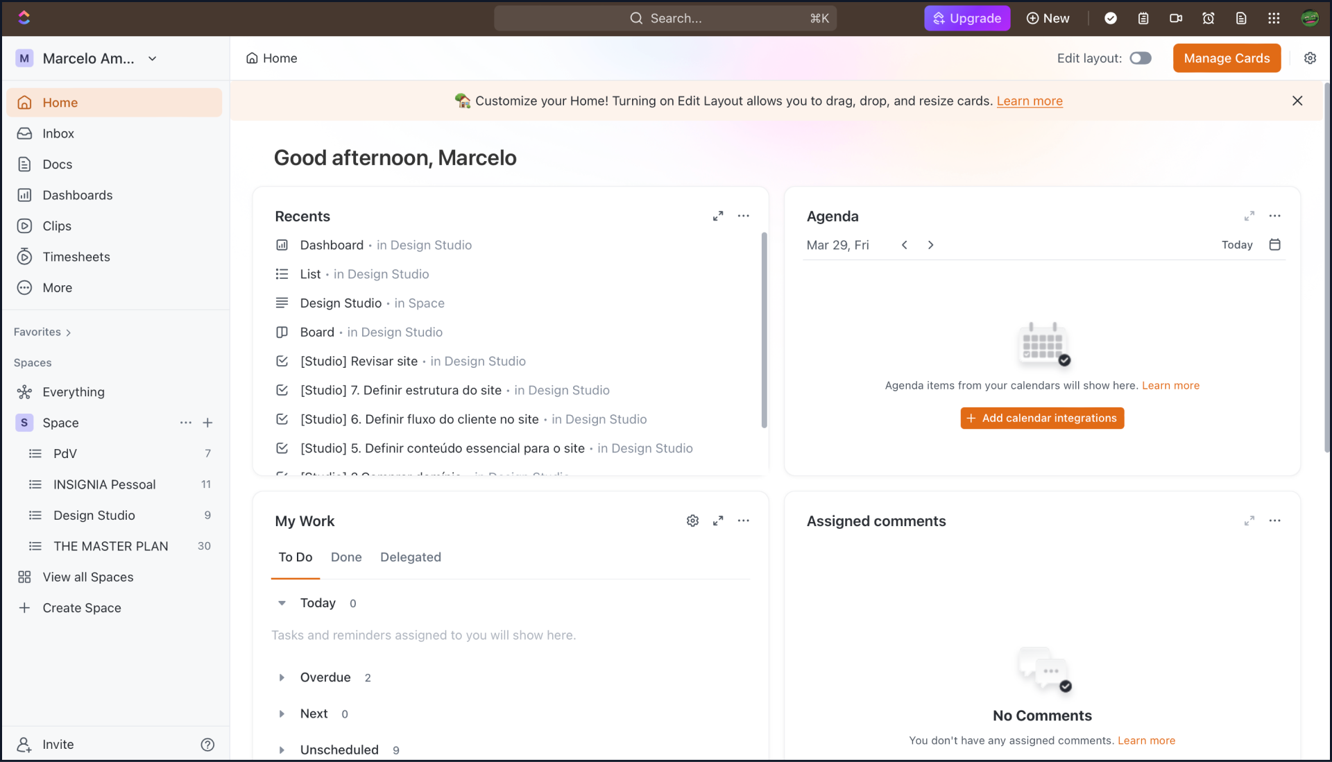
Clickup web app homescreen. Source: www.clickup.com
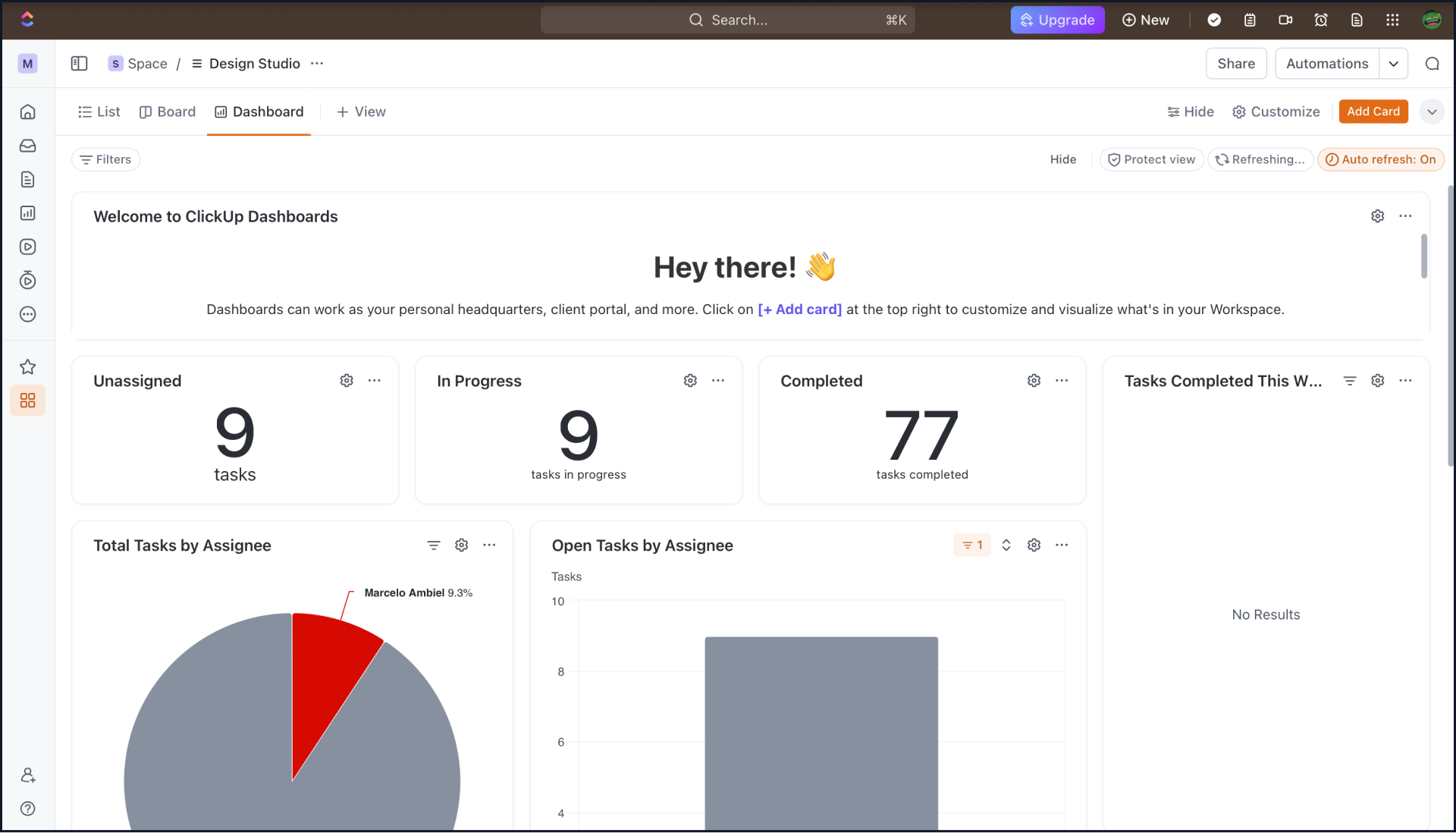
Clickup web app dashboard. Source: www.clickup.com
4 - Mapping the flow
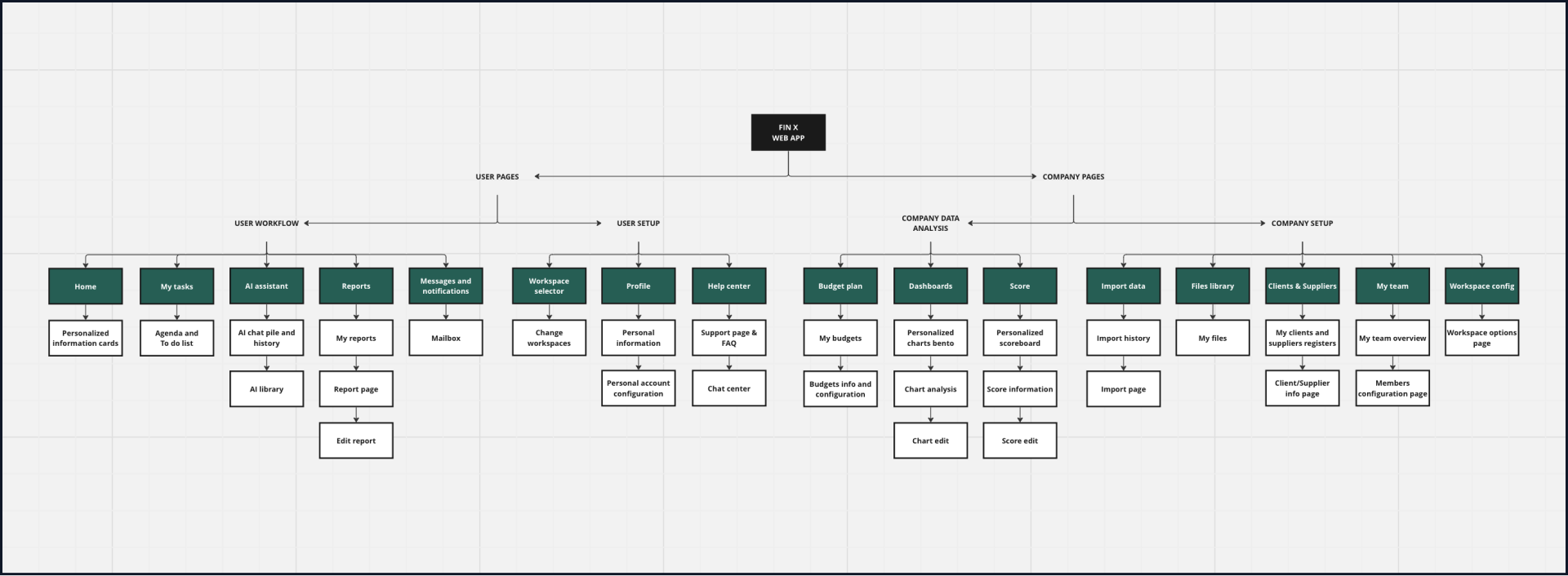
Flow chart organization for the Fin X intelligent finance tool. Source: Double Nice studio
Following the benchmark review, I mapped the platform into a practical information architecture. The goal was to separate high-frequency analytical tasks from secondary configuration areas, helping users reach the work that matters most without navigating a deeply layered system.
User pages: Core areas for dashboards, reports, forecasts, analysis, collaboration, and AI assistance.
Company pages: Configuration, account management, and organization-level settings accessed when needed.
This structure defined the priority journeys for the prototype: opening a personalized dashboard, investigating a forecast in detail, and using the AI assistant to turn questions into clearer next steps.
5 - Designing the interface
With the product structure in place, I explored multiple layout directions through quick sketches and low-fidelity wireframes. The purpose was to test hierarchy, screen relationships, and information density before introducing visual detail.
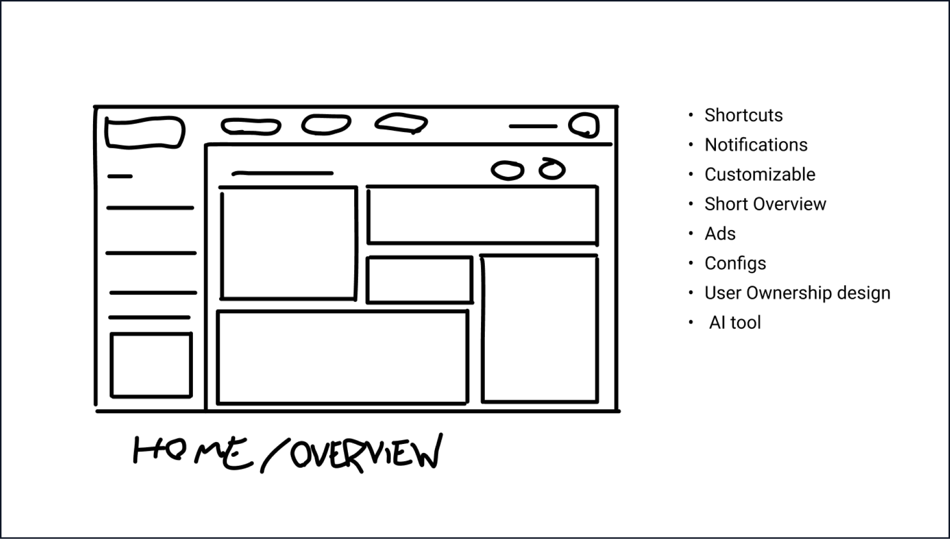
Fin X web app homescreen low fidelity concept.
Source: Double Nice studio
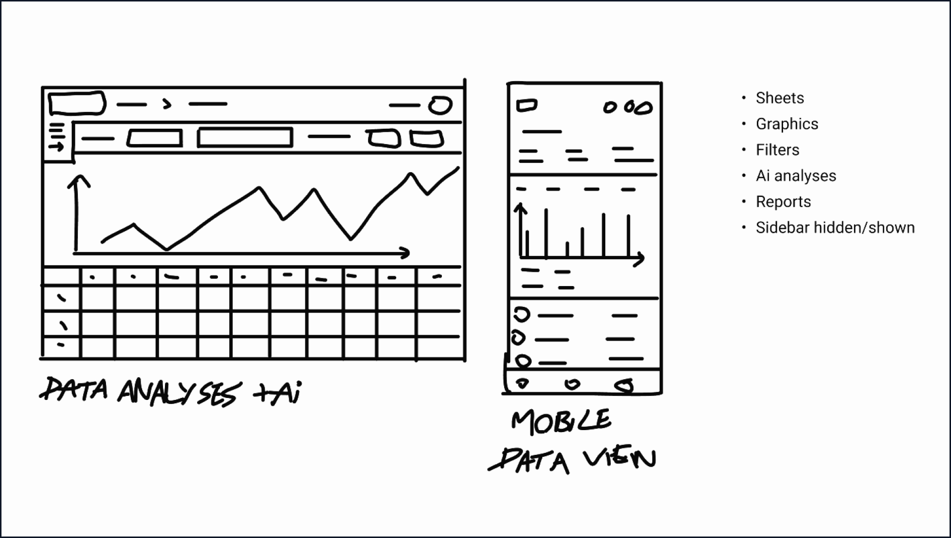
Fin X web app and mobile data analysis screen low fidelity concept. Source: Double Nice studio
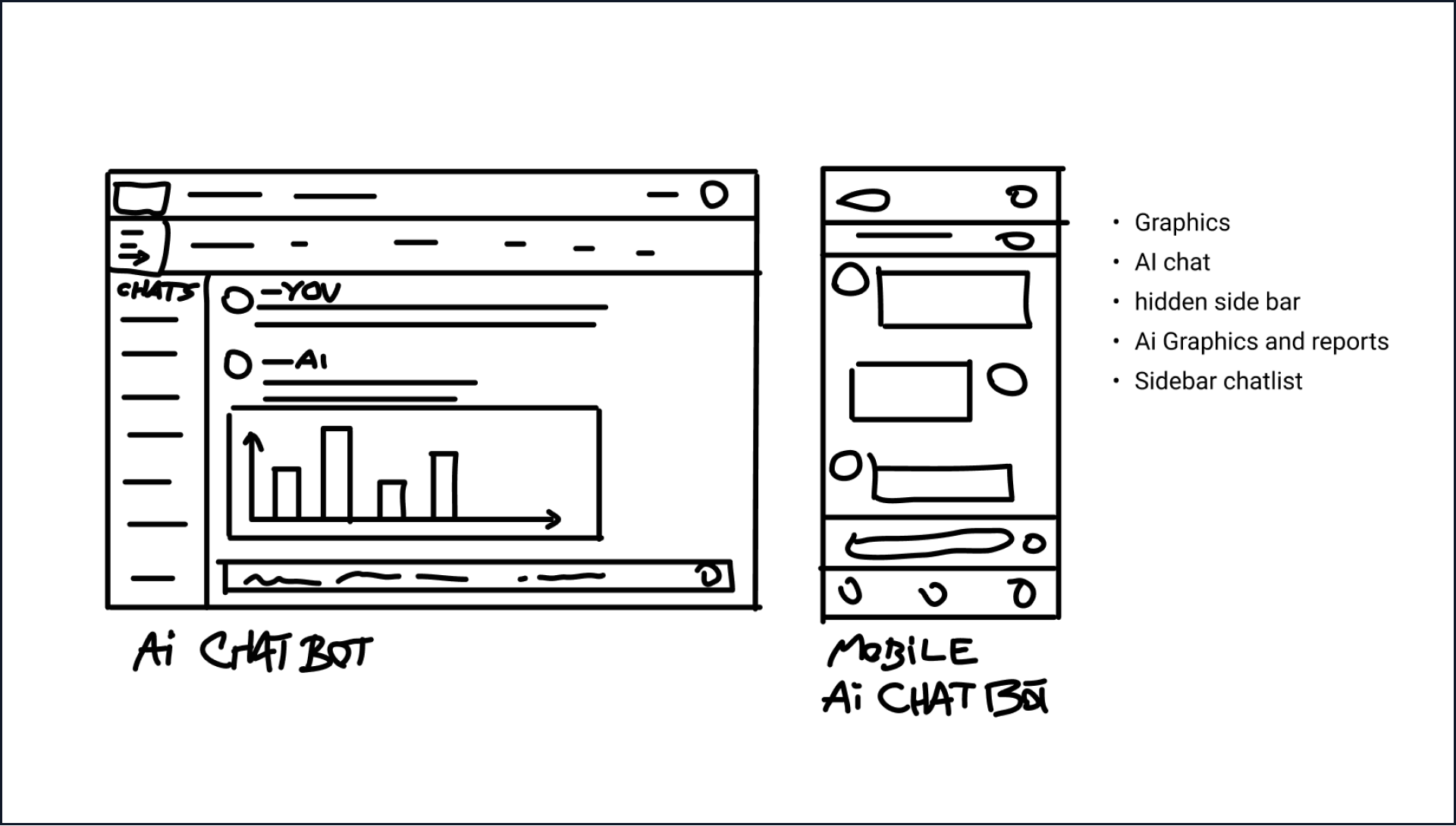
Fin X web app and mobile AI assistant screen low fidelity concept. Source: Double Nice studio
The strongest concepts were developed into structured wireframes, with a focus on predictable navigation, clear content zones, and a consistent relationship between metrics, charts, tables, and actions.
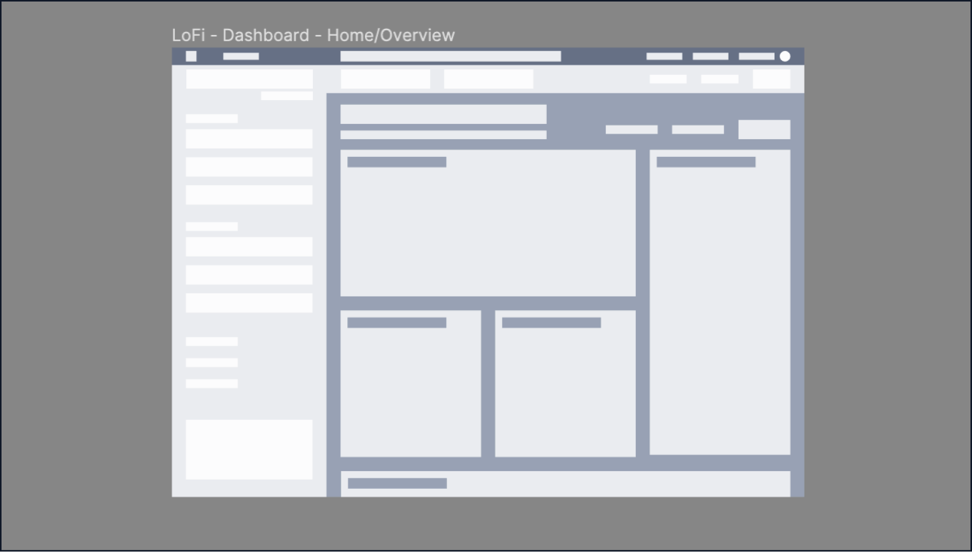
Fin X web app homescreen wireframe.
Source: Double Nice studio
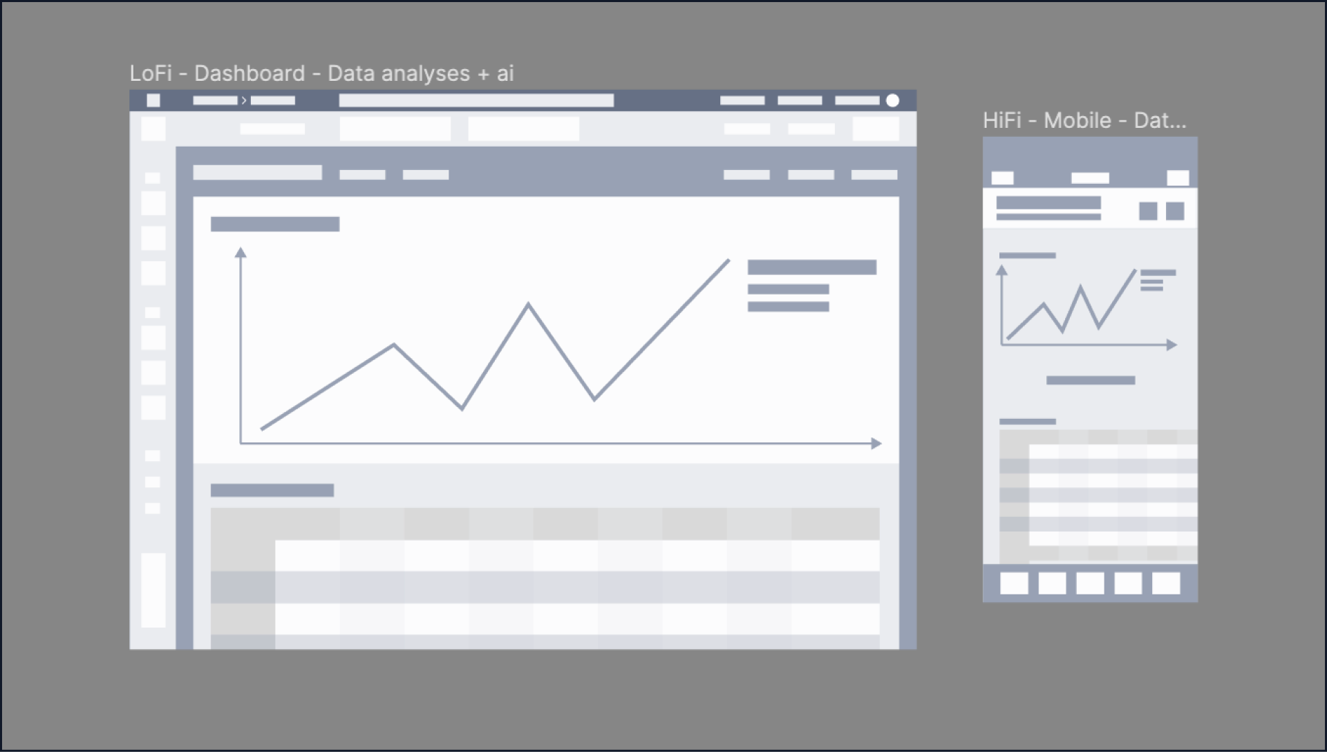
Fin X web app and mobile data analysis screen wireframe.
Source: Double Nice studio
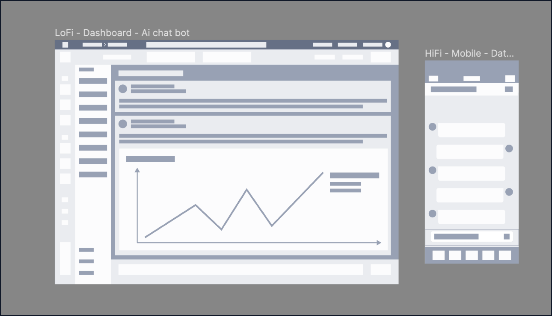
Fin X web app and mobile AI assistant screen wireframe.
Source: Double Nice studio
During this phase, accessibility guided the visual system. A restrained teal-and-neutral palette, clear contrast, and an intentional type hierarchy helped create a modern financial interface that feels focused rather than cold.
Using Satoshi as the primary typeface and Roboto as a secondary utility font gave the product a distinctive visual voice while keeping dense labels, data, and controls easy to read.
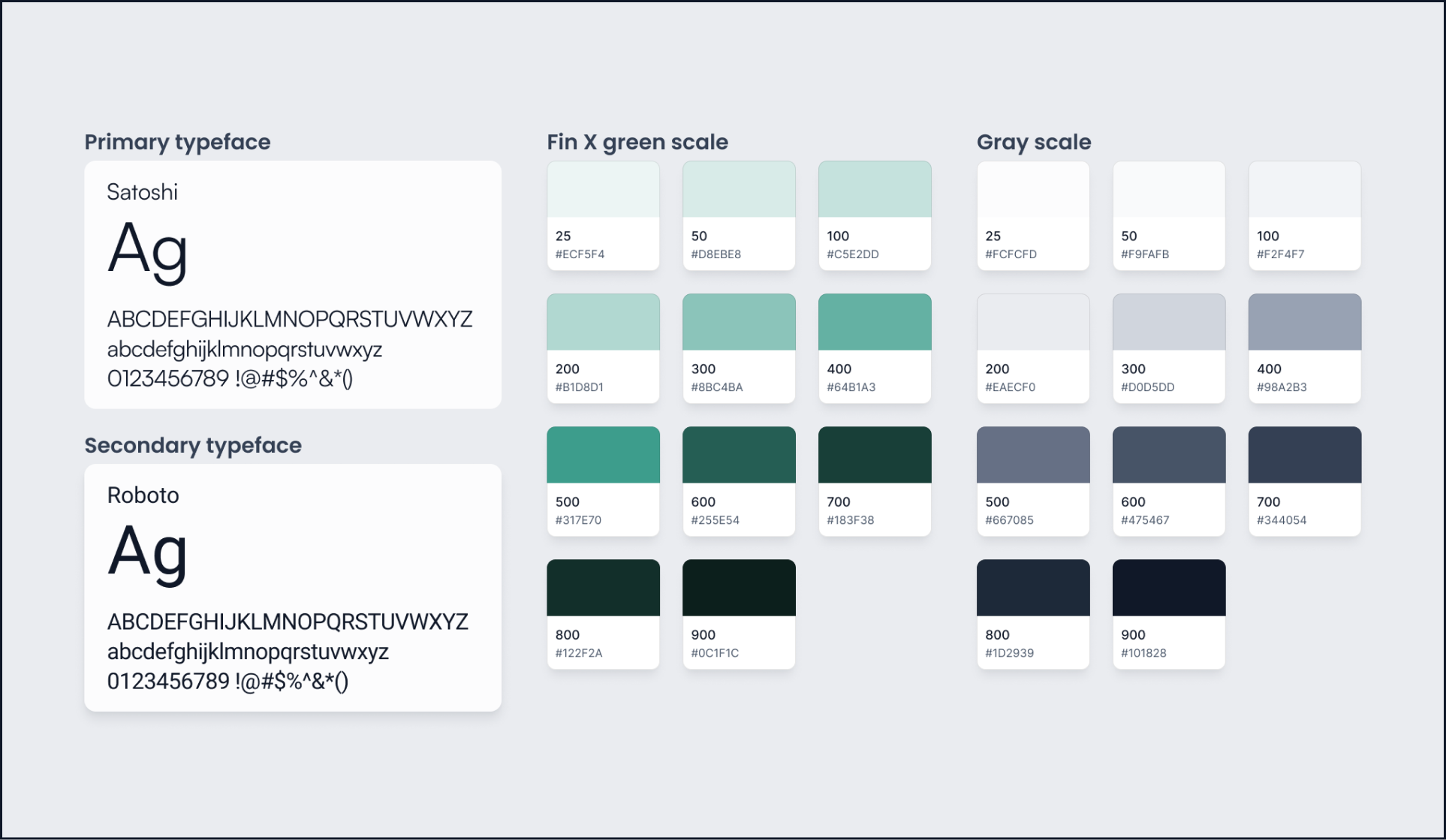
Fin X intelligent finance tool style guide.
Source: Double Nice studio
5.a - Homescreen
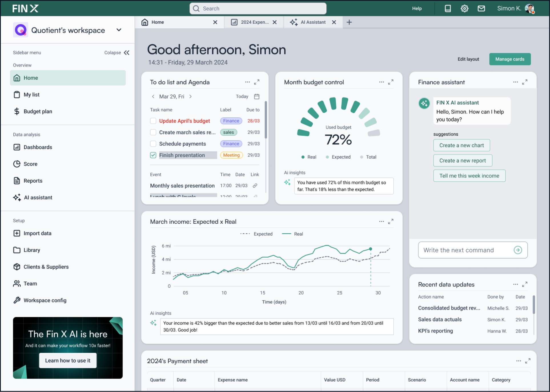
Fin X web app high fidelity homescreen
Source: Double Nice studio
The home screen gives users a concise, personalized view of the day: key financial signals, forecast progress, recent activity, and work that needs attention.
The layout is designed to answer “what changed?” before asking the user to explore detailed reports, helping finance teams quickly identify where their attention is most valuable.
5.b - Data analysis screen

Fin X web app high fidelity data analysis screen. Source: Double Nice studio
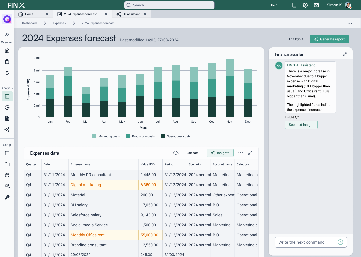
The data-analysis workspace brings visualization, filtering, and detailed expense information into one connected view.
Users can compare performance at a glance, narrow the data set, and trace a trend back to the individual items behind it without losing their place in the workflow.

Fin X web app high fidelity data analysis screen featuring AI assistant insights Source: Double Nice studio
5.c - AI assistant screen
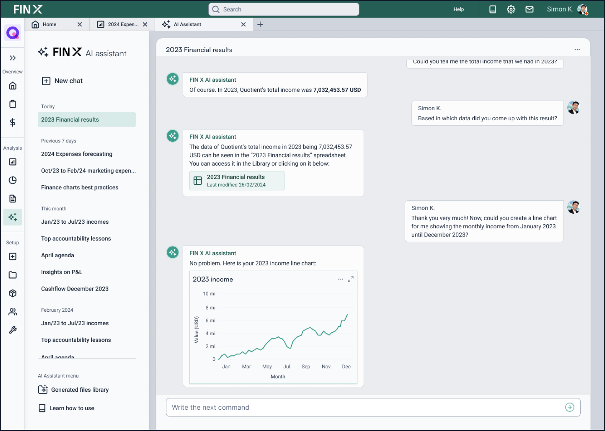
Fin X web app high fidelity AI assistant screen
Source: Double Nice studio
The AI assistant was designed as a contextual layer for analysis and reporting rather than a separate destination.
It can help users investigate questions, surface relevant information, summarize trends, and prepare next steps while keeping the underlying data visible and accessible.
5.d - Navigation hub
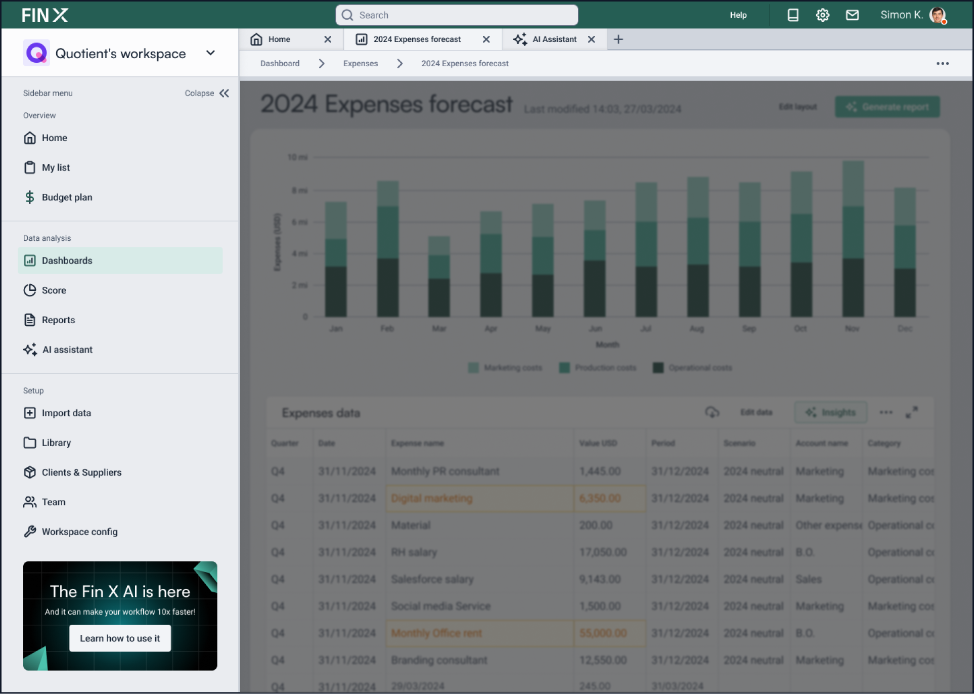
Fin X web app high fidelity navigation hub detail.
Source: Double Nice studio
The navigation system supports the product’s breadth without making it feel overwhelming.
High-frequency areas remain close to the user’s daily workflow, while lower-frequency company, account, and configuration pages live in a separate and predictable space.
5.e - Mobile screens
The mobile experience focuses on the moments when users need a quick read rather than a full desktop analysis.
Key metrics, updates, and assistant interactions are simplified into a focused interface that remains useful while users are away from their main workspace.
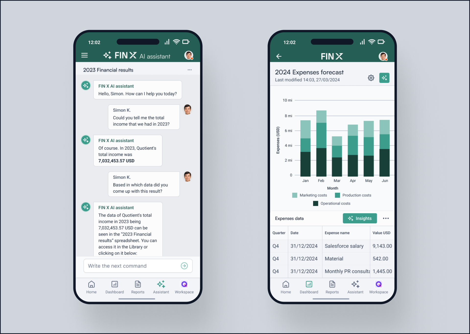
Fin X web app high fidelity navigation hub detail.
Source: Double Nice studio
6 - Prototyping interactions
The prototype brought the core Fin X journey to life: moving from the dashboard to a forecast, filtering data, drilling into expense details, and using AI assistance within the same context.
The interactions were designed to make the system feel connected and responsive, while also testing the pacing, clarity, and hierarchy of the overall experience before finalizing the screens.
Fin X web app high fidelity prototype demonstration. Source: Double Nice studio
7 - Presentation design
The final presentation was designed as a walkthrough of the product rather than a collection of isolated screens.
It introduces the challenge, explains the product structure, and highlights the key workflows in a sequence that helps stakeholders understand both the interface and the thinking behind it.
Insights from the benchmark review informed the presentation format: concise framing, visual examples, and a clear progression from problem to solution.
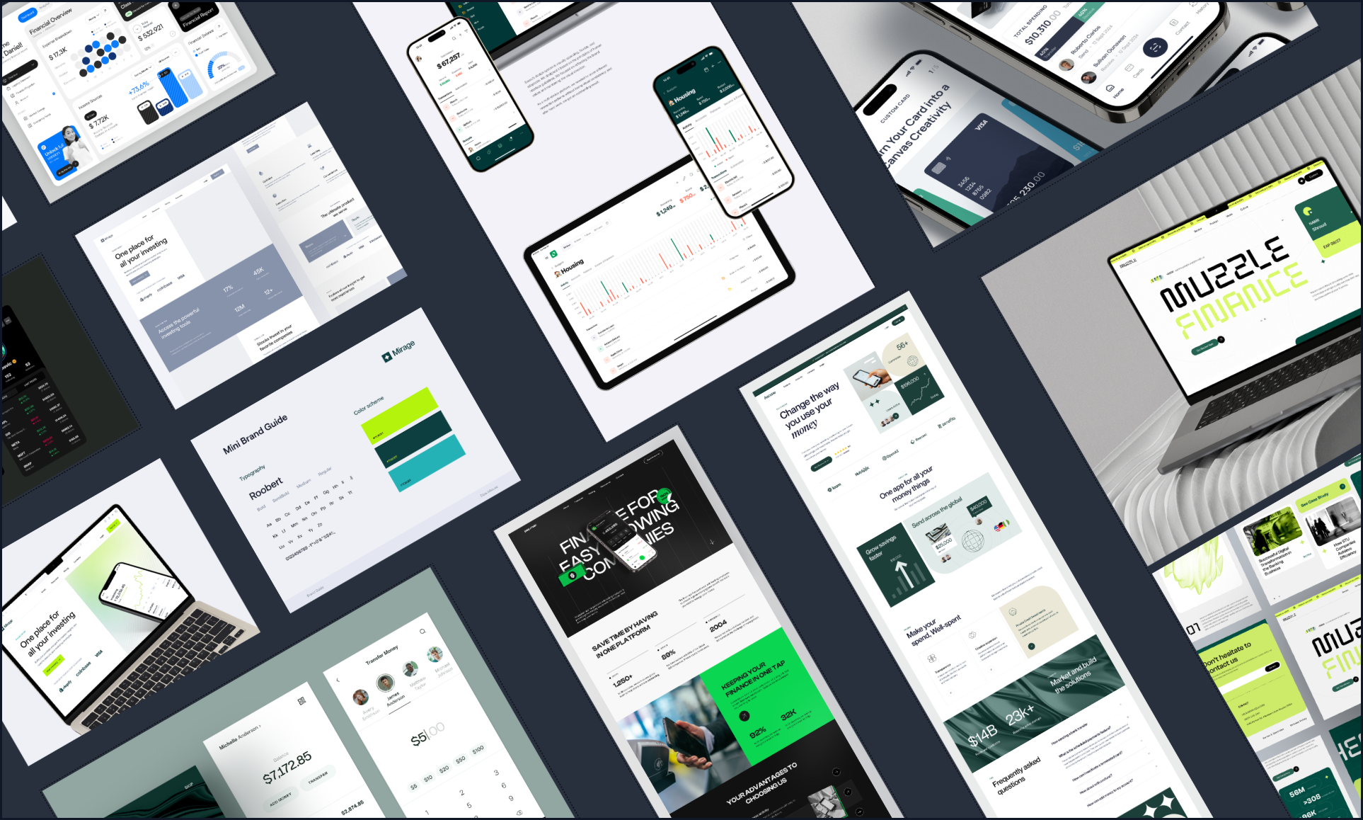
Benchmark examples Fin X provided. Source: Fin X team
After exploring a few storytelling directions, I selected the structure that gave each design decision enough context without slowing the pace. The result was a presentation that could introduce Fin X clearly to both business and design audiences.
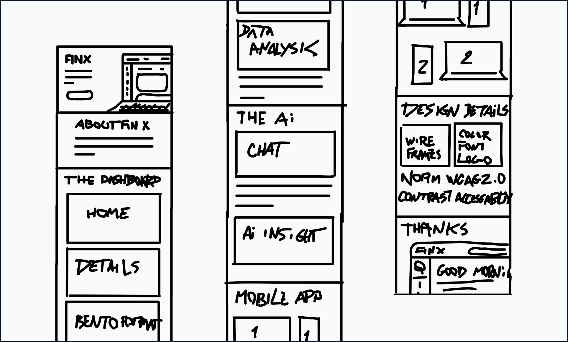
Fin X intelligent finance tool presentation sketch. Source: Double Nice studio
In the final phase, every slide was refined to align with the Fin X visual system. Consistent typography, spacing, and imagery helped the concept feel cohesive, credible, and ready for discussion.
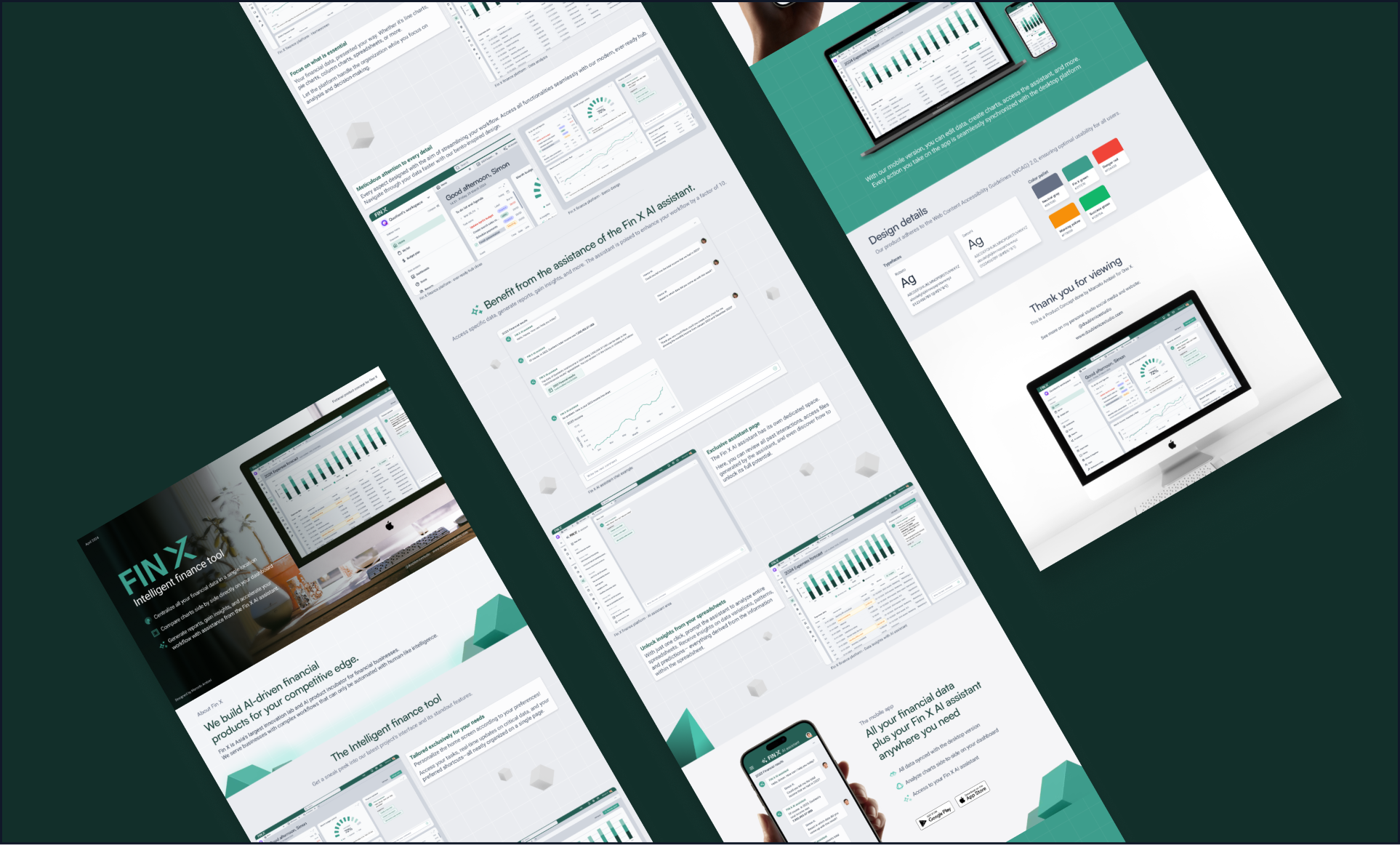
Fin X intelligent finance tool presentation final version. Source: Double Nice studio
8 - Conclusion
Fin X was an opportunity to explore how a complex financial workspace could become more understandable, responsive, and useful in the flow of decision-making.
From information architecture to responsive screens, every design decision focused on helping users move from dense data to clearer action.
The project demonstrates how I approach complex B2B SaaS problems: simplify the structure, respect the depth of the workflow, and use thoughtful interaction and visual systems to make sophisticated tools easier to use.